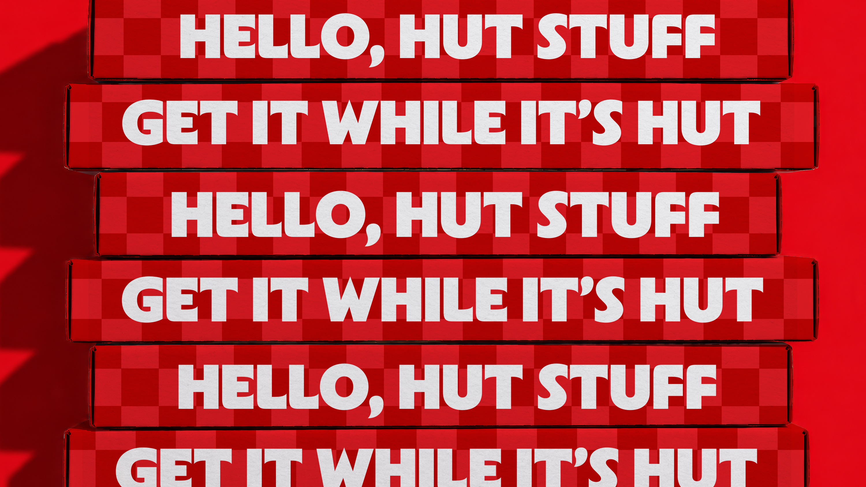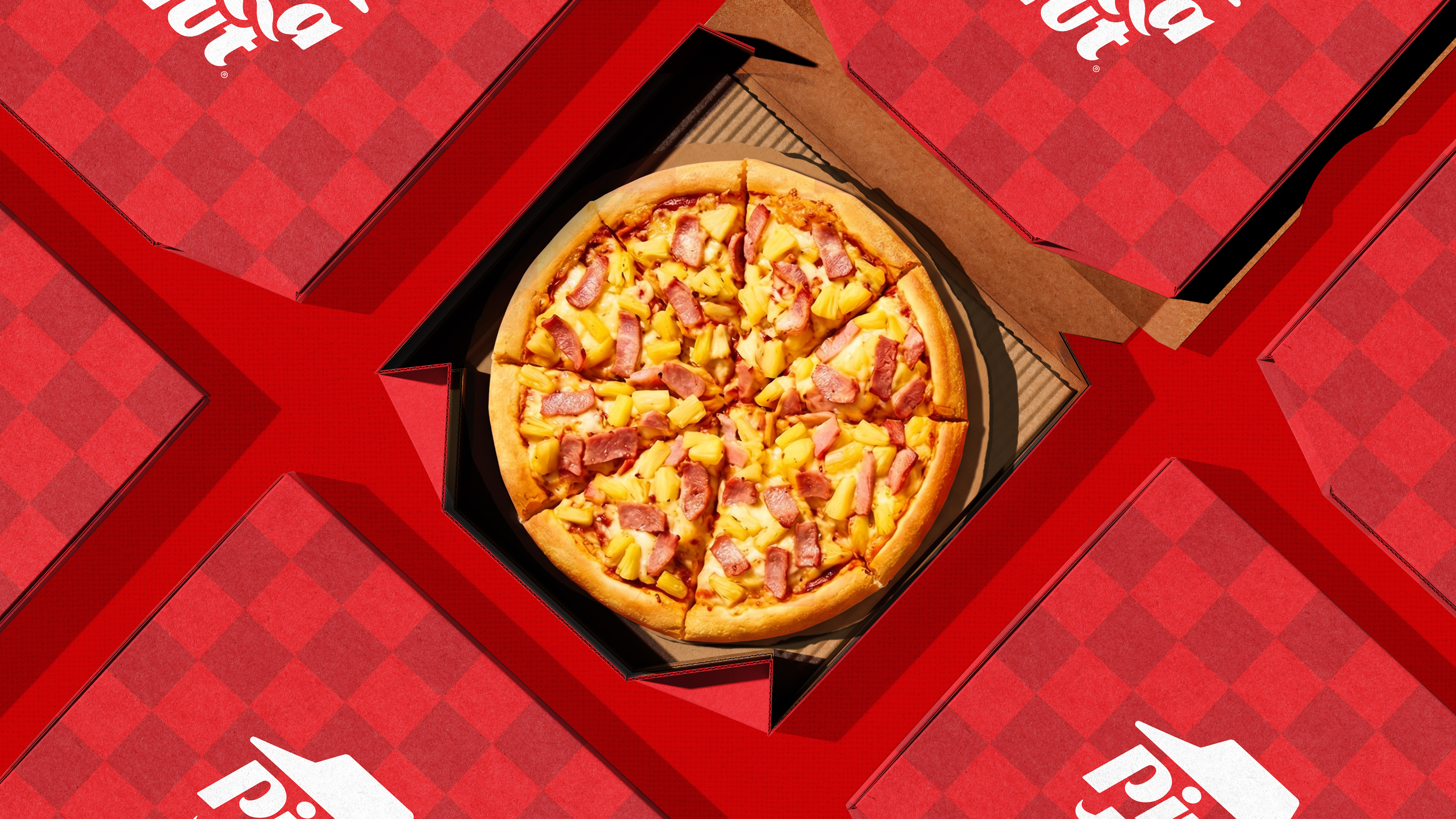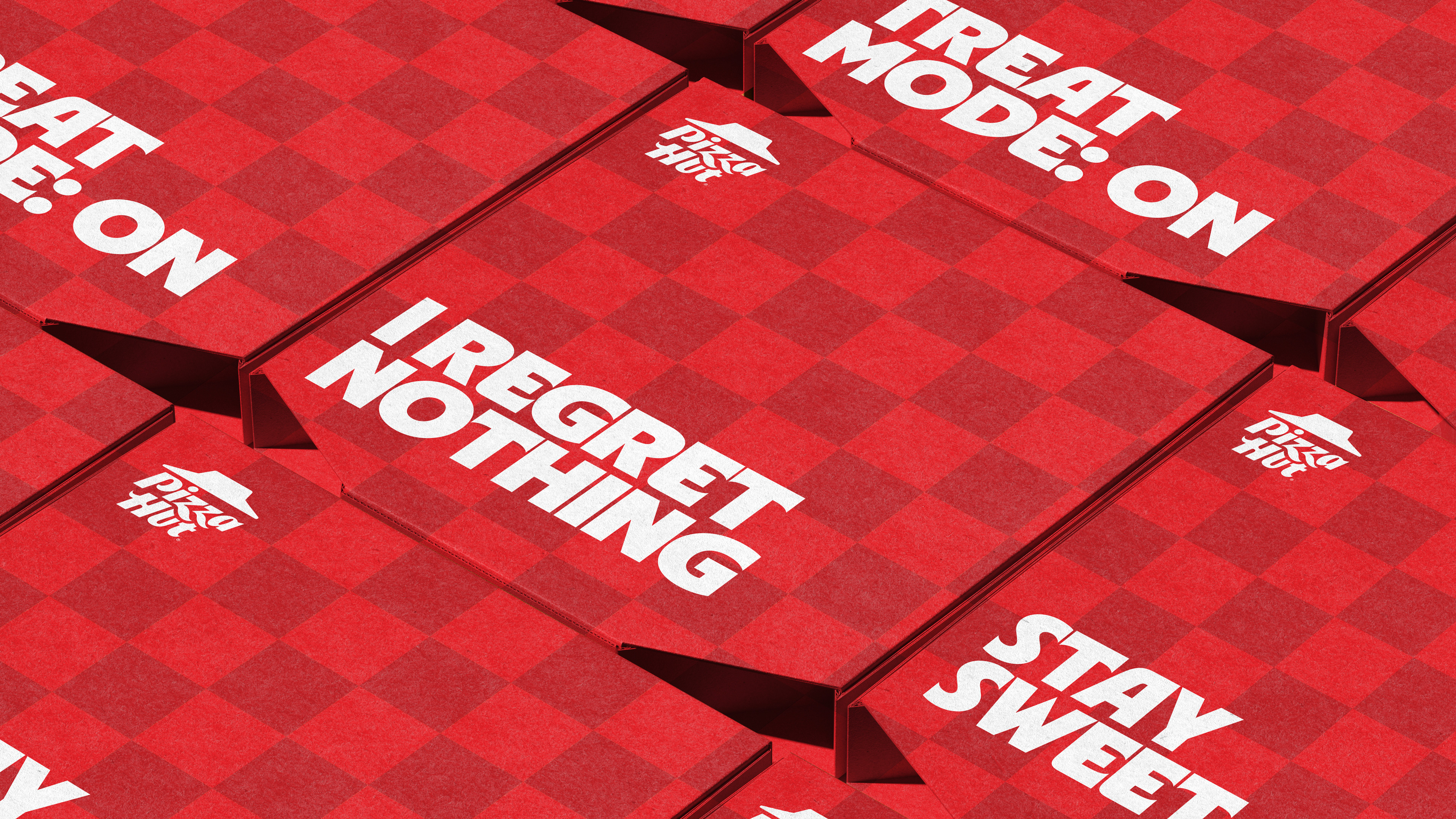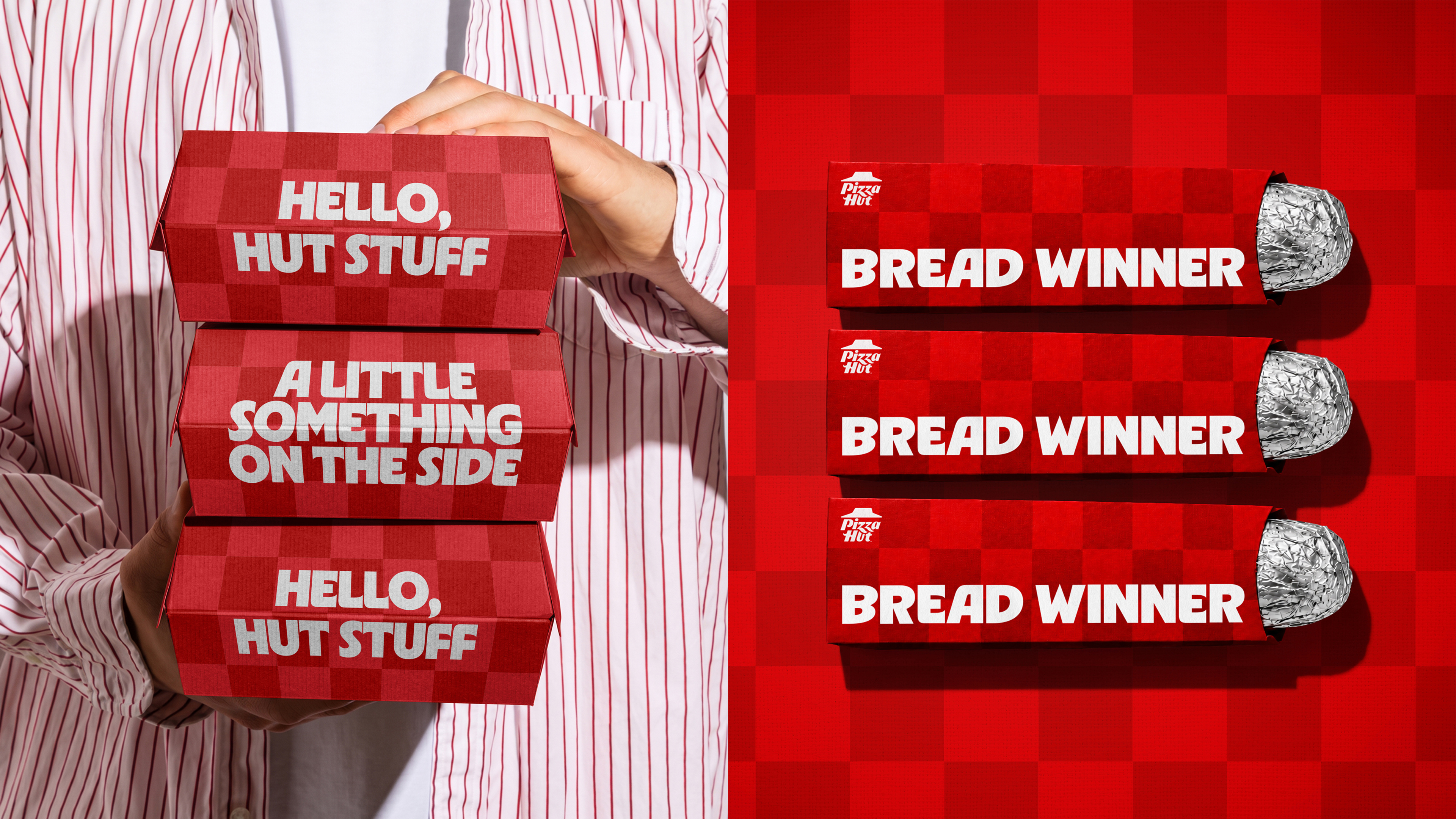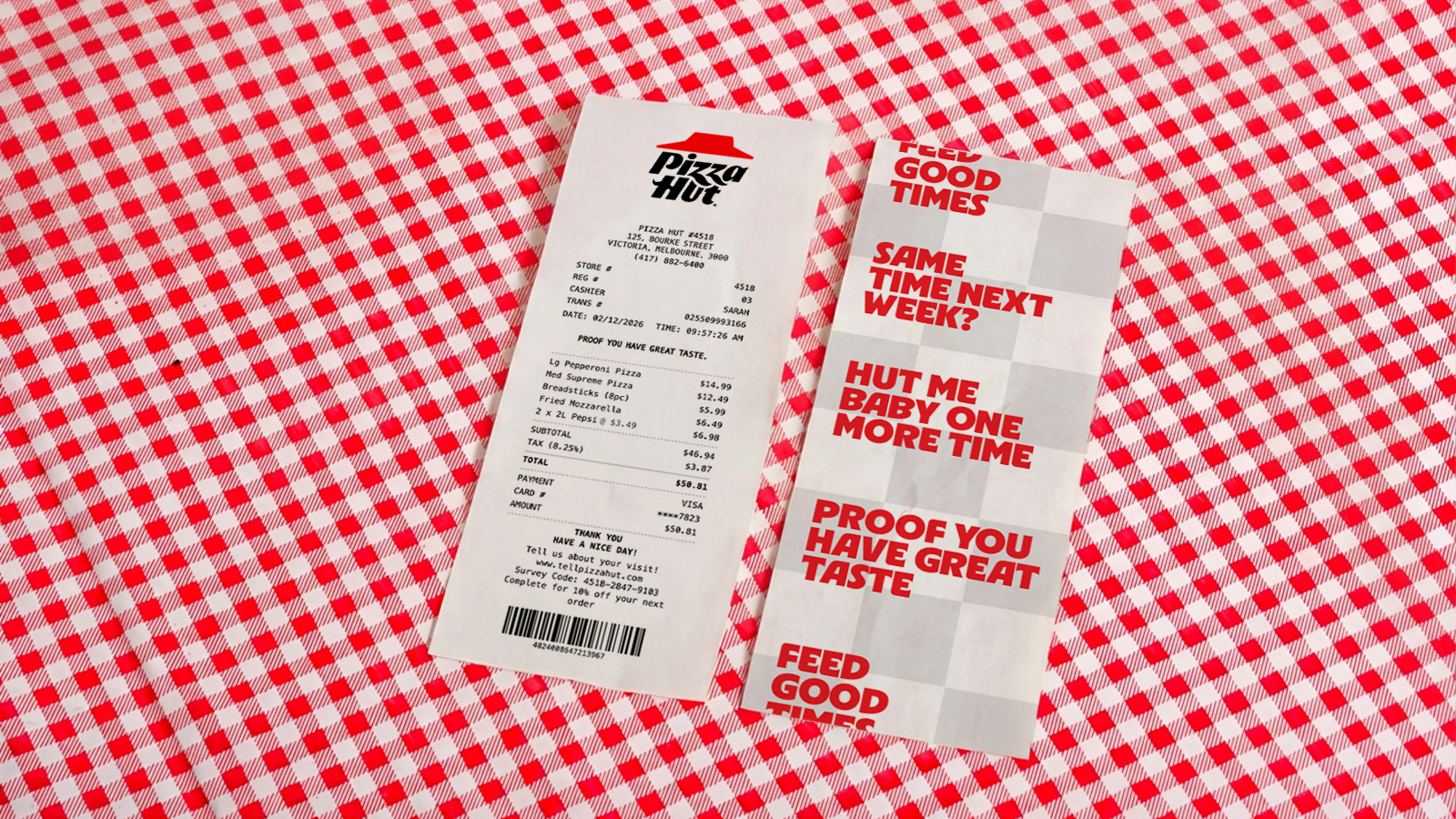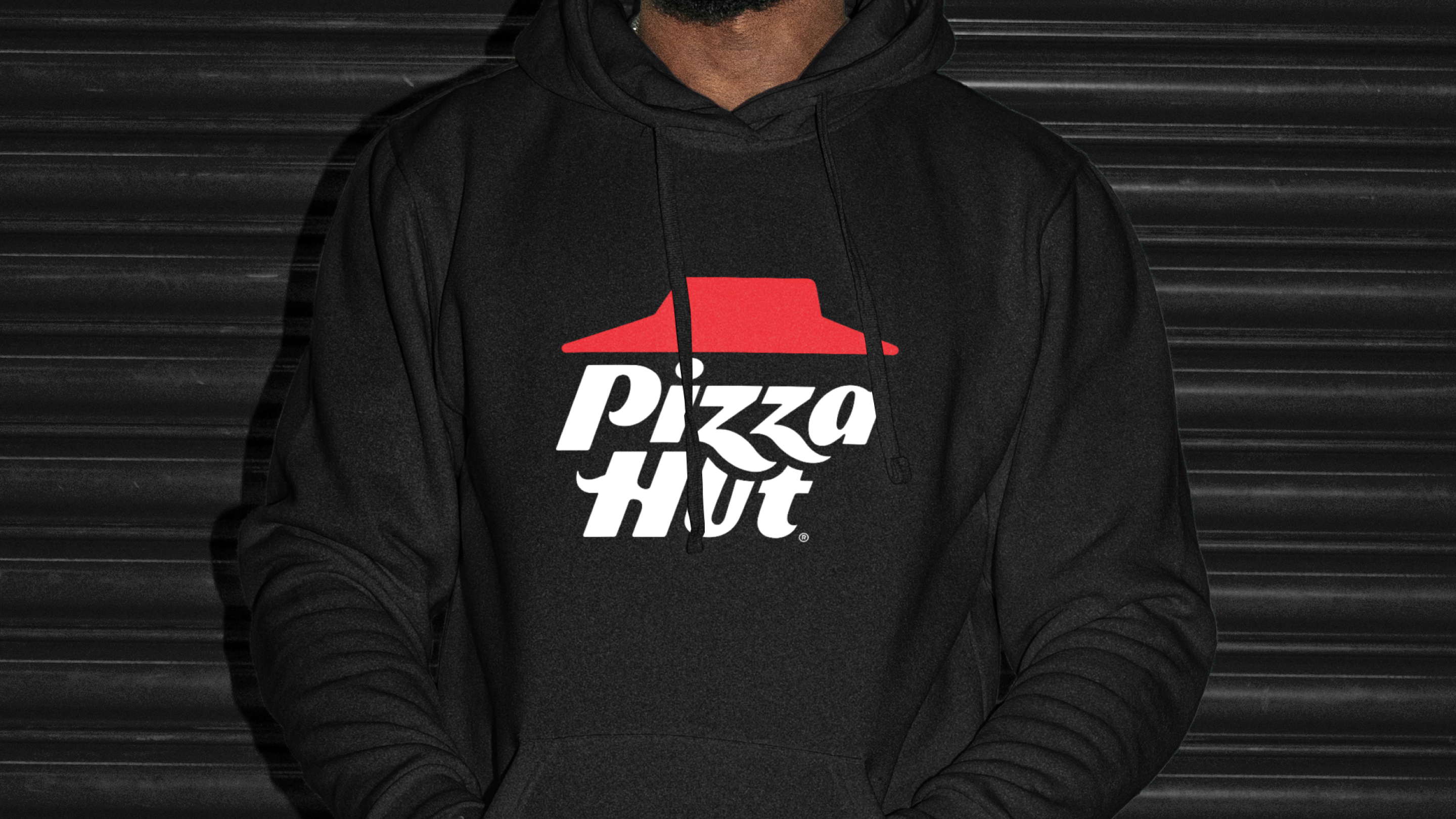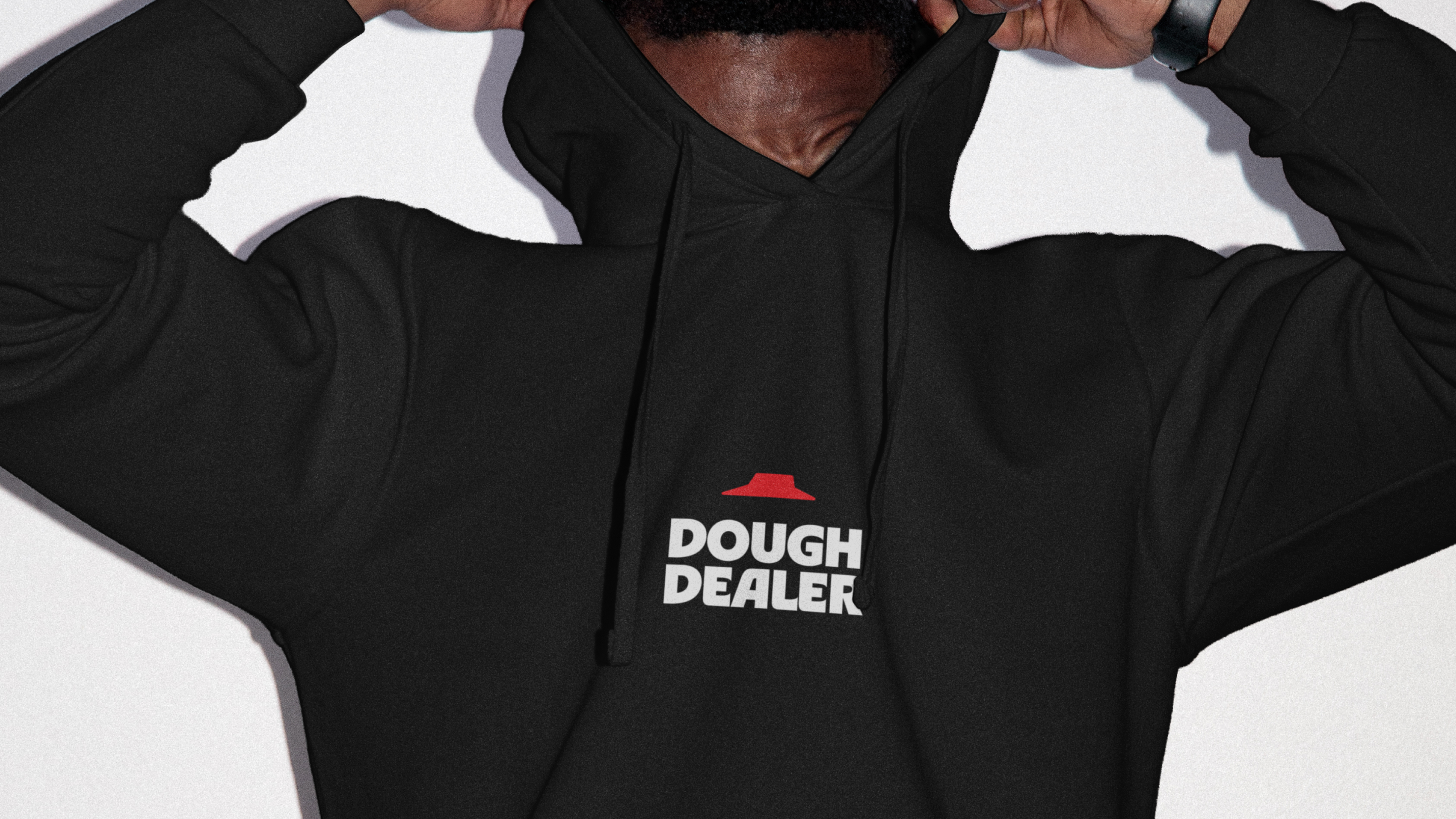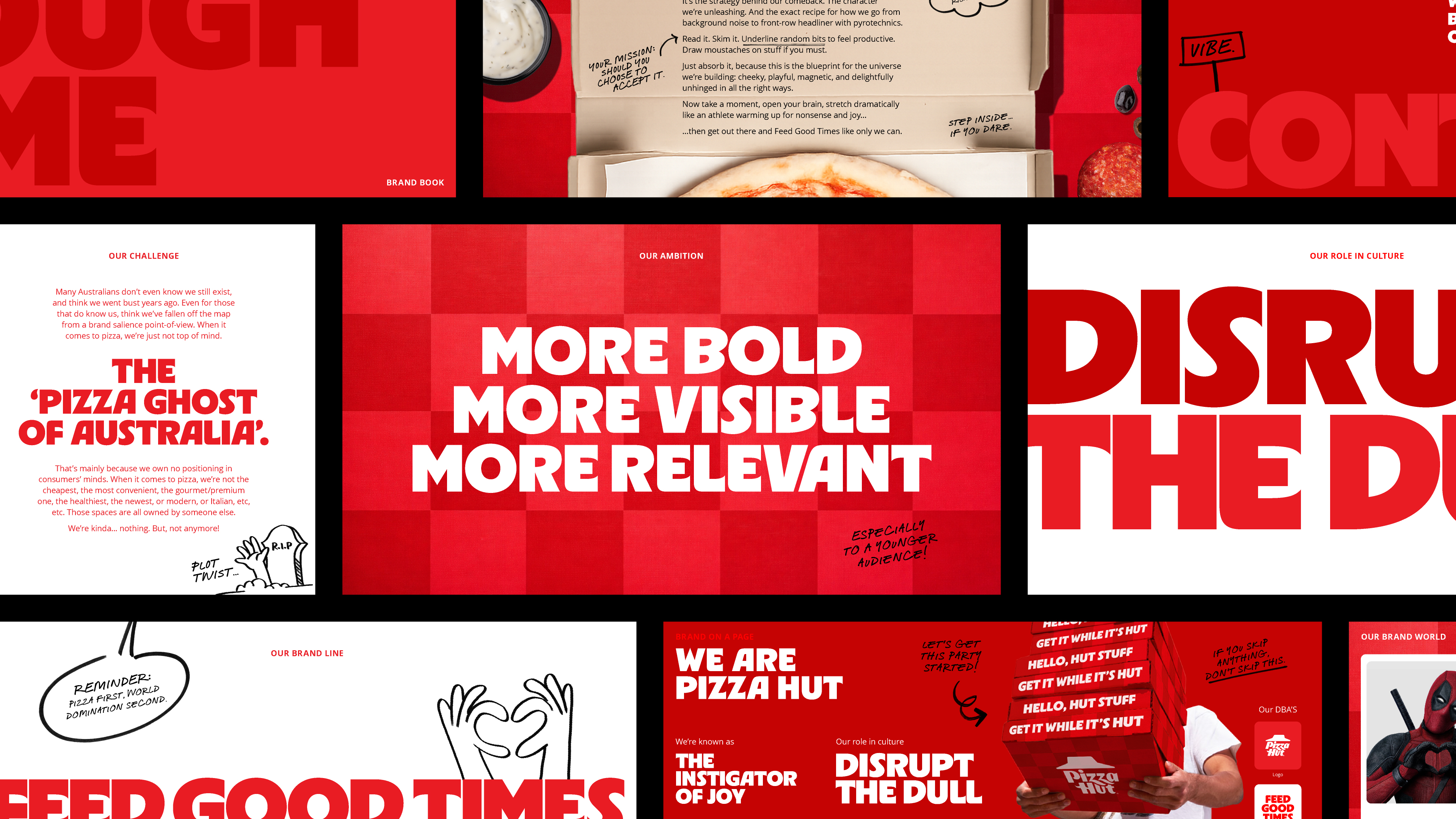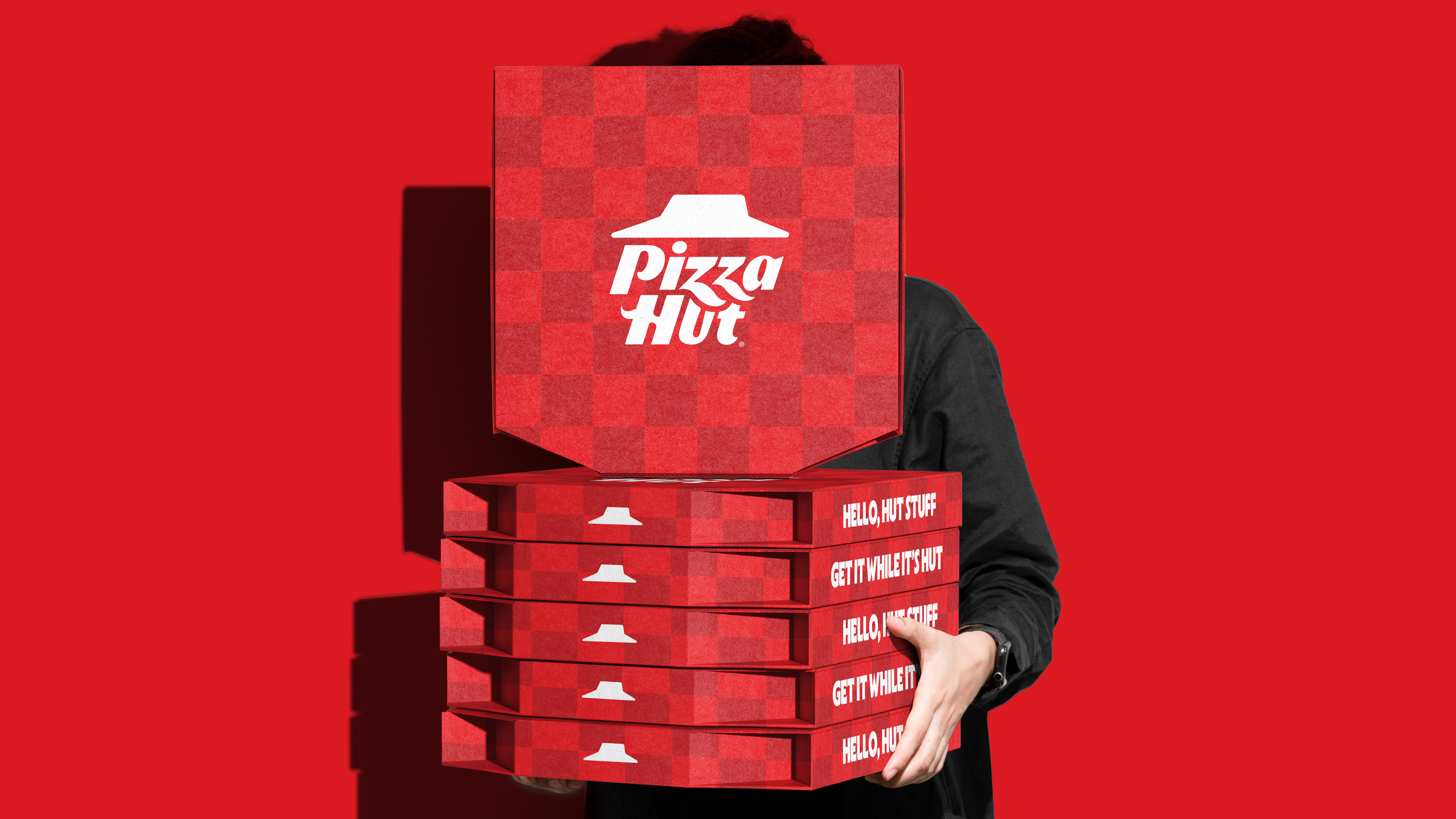

Pizza is pizza is pizza. It’s a very commoditised category, in which it’s extremely hard to stand out via your actual product. In fact, Pizza Hut’s comms often suffered misattribution, making it even worse, our packaging didn’t even provide distinction either.
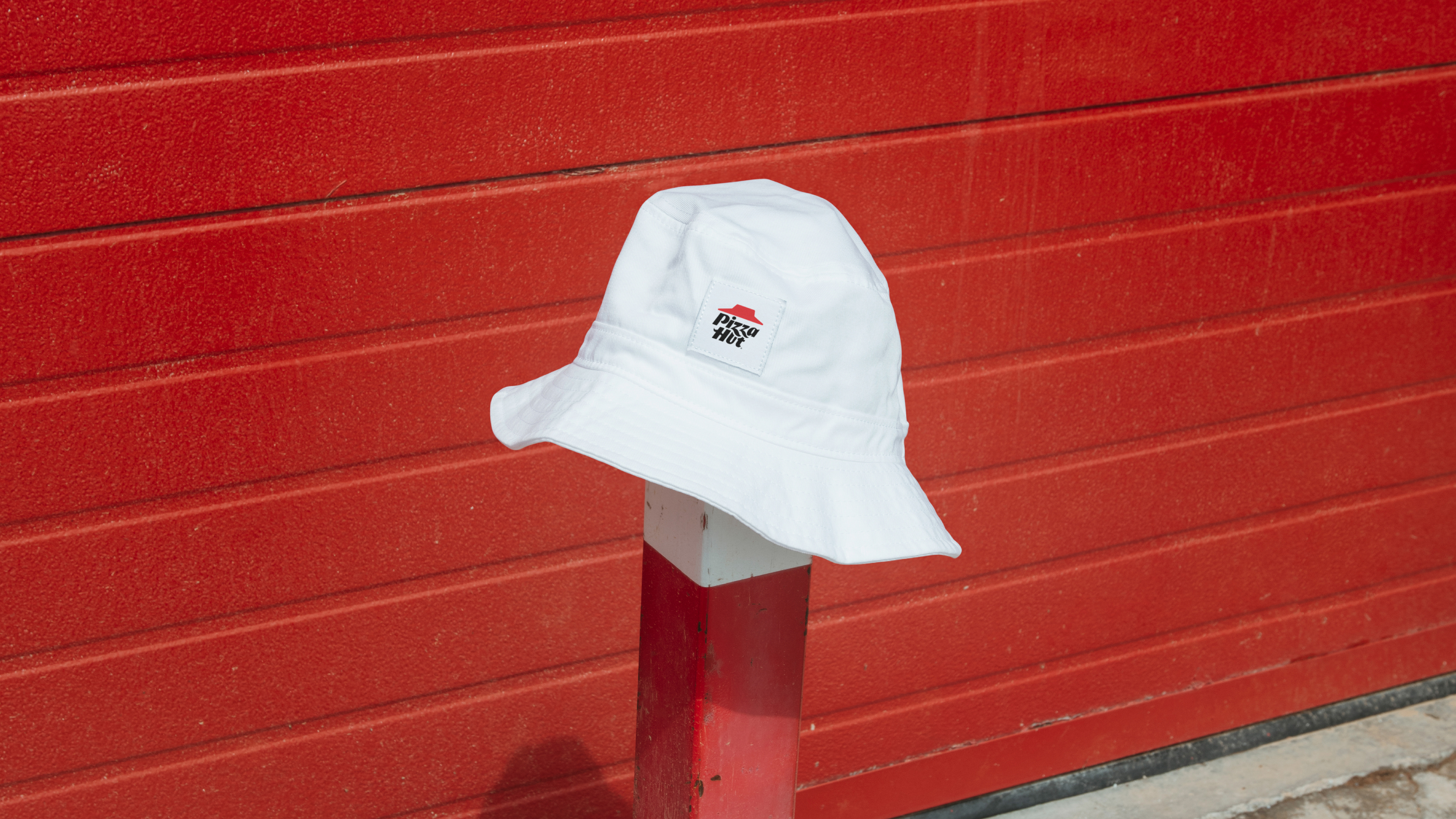
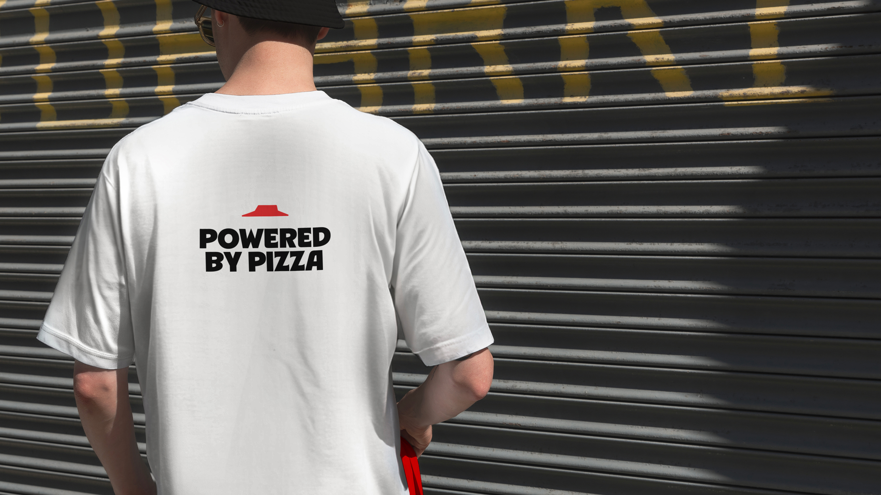
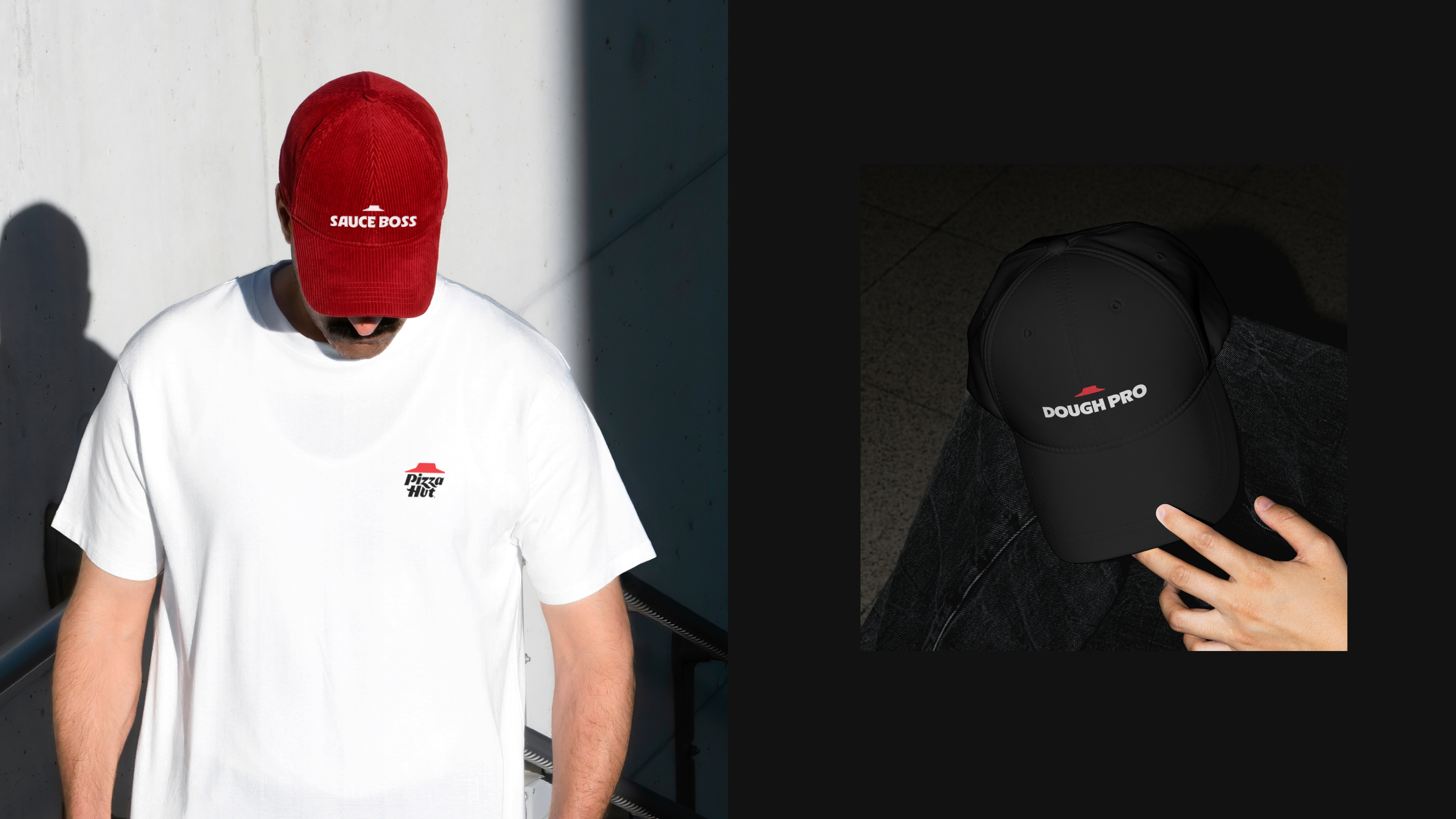
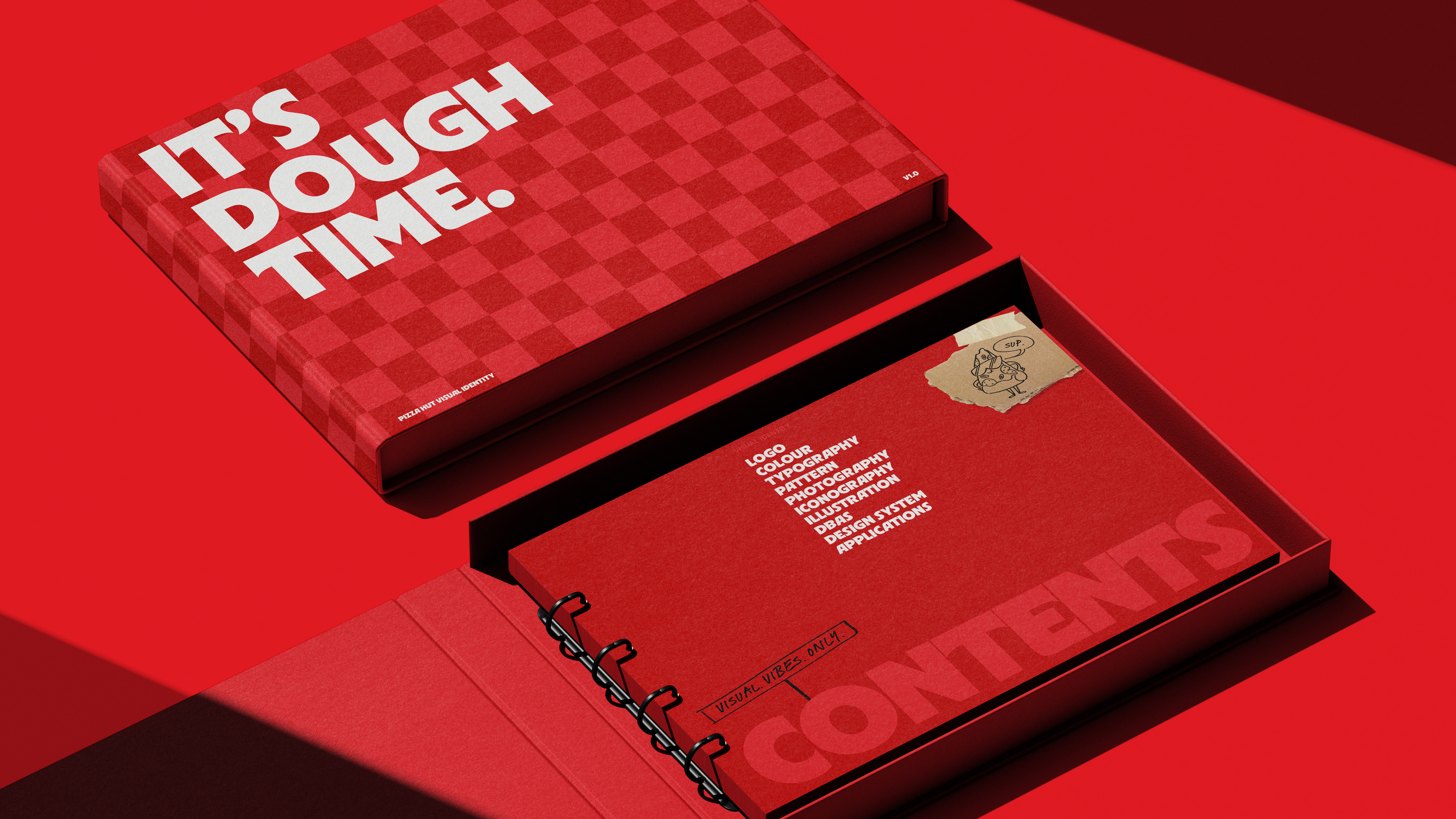
We took subtle but existing DBAs - our check pattern and our red - and made them a powerful and memorable DBAs. Combined with our new engaging TOV, we ensured we achieve the D in DBA: Distinctive. Feed Good Times.